I’ve had a lifelong fascination with classic hand drawn character animation. When I became interested in typography and lettering I realized that one of the things that I adored in classic animation was the lettering that appeared in scenes, on title cards, in credits and on marketing materials. I was sitting in a McDonald’s drive thru in the late 90s when I had the idea that I wanted to make some typefaces inspired by my love. Specifically, as is often the case with me, the idea grew out of me being frustrated about something. In this case, McDonalds was promoting Happy Meals that tied into the latest Disney film using a badly drawn, boring, old off-the-shelf font that was bundled for free with popular graphic design software. It seemed insulting that hundreds of artists produced millions of drawings over four years to create and the result was being branded with a typeface that could only have been picked with the thought, “Eh, that’s good enough.” I drew sketches for ideas in my notebooks for years before I found the form that I wanted: a bouncy version of a classic American gothic. It was generic enough that it could be used in all of the needed environments, and it would be fun to draw.
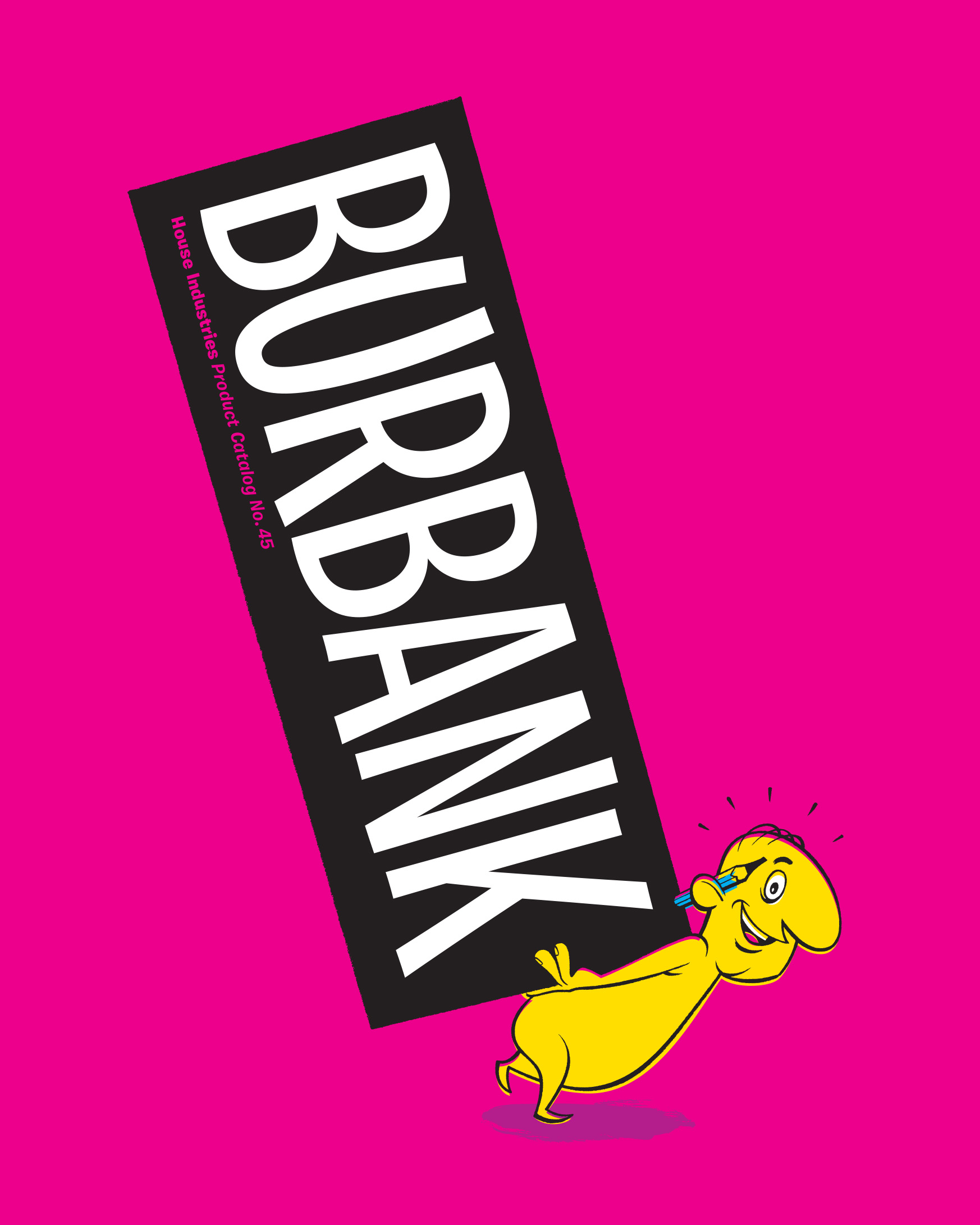
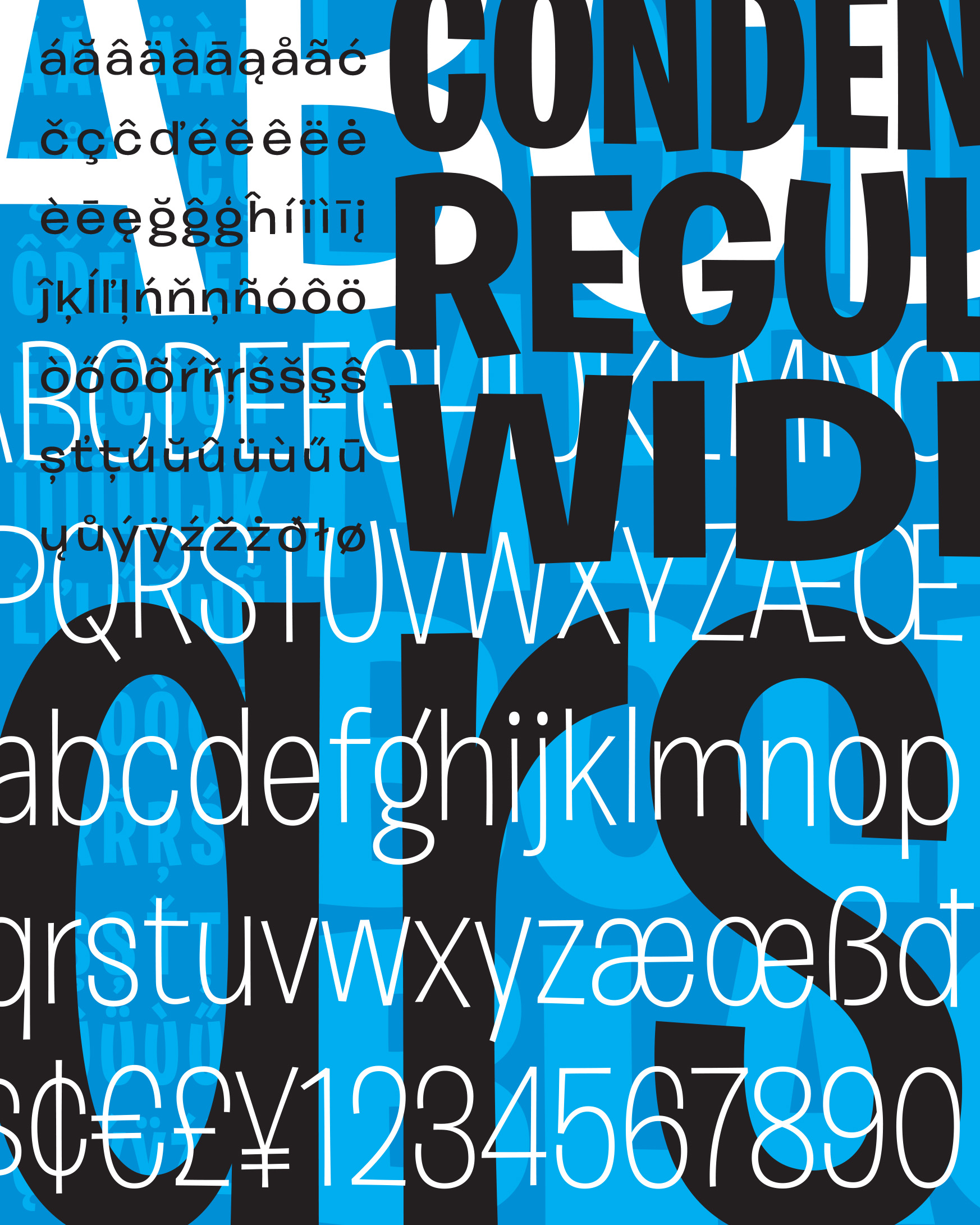
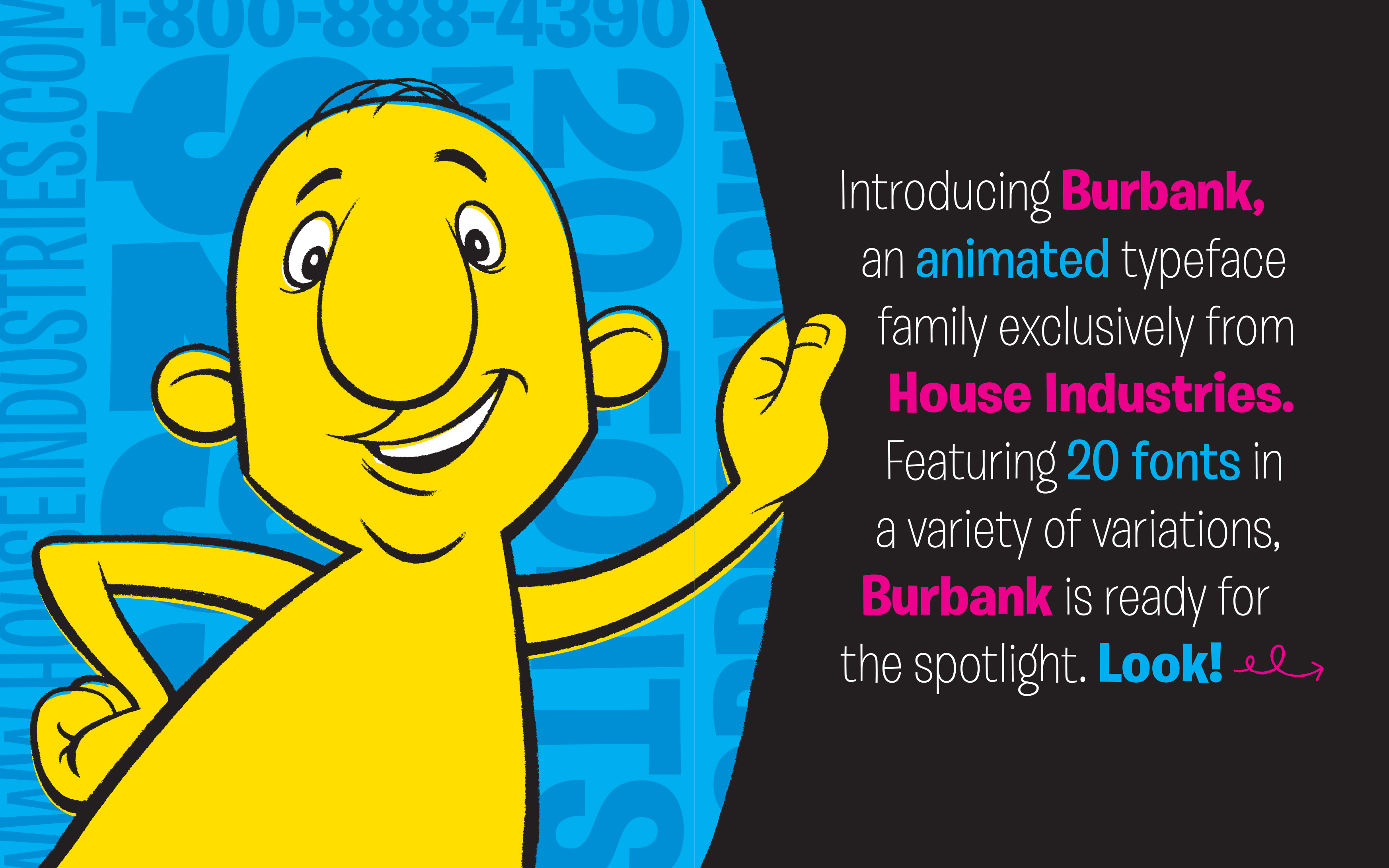
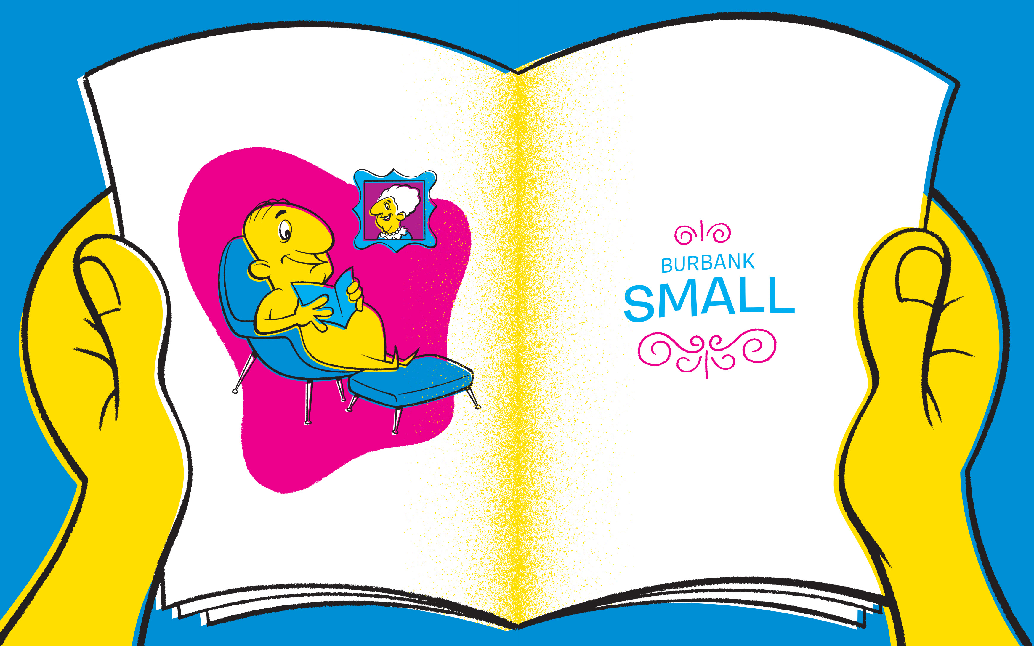
I showed the early drawings to my bosses at House Industries and they wanted to publish it. I drew all of the weights and widths that I would have wanted when I was a graphic designer. I also drew a text version so that paragraphs could have some fun, too. I had left the employ of House by the time I finished Burbank, but they graciously let me finish the project using the full resources of the studio. I designed the catalog, packaging, t-shirts, posters and assorted gee gaws using a character custom developed for the family by House illustrator Chris Gardner. It was so much fun.
My initial goal was just to get this typeface out of my head. It had been haunting my thoughts for 10 years at that point. I never envisioned what would come after it was done: It has been on millions of Lego packages. It has been seen by hundreds of millions of Fortnite players for what has to be billions of hours of gameplay. It was used in the highest-grossing animated film of all time. It is used in the Disney parks. It has become the standard typeface on Spanish magicians’ YouTube videos. And, those are just the uses I remember. It has been used on so many things that it made me famous in the lunch room of my kids’ elementary school, much to my kids’ chagrin.
Creative Director: Andy Cruz
Type Director: Ken Barber
Executive Producer: Rich Roat
Kind Friend: Christian Schwartz
Illustrator: Chris Gardner