
Wired Z.K
Wired has a tradition of introducing the feature section of each issue with an illustration or photograph that sets the tone for the stories that will follow. Much to my surprise, I had the opportunity to contribute this illustration for Wired 26.11. It was one of the most fun projects I’ve ever worked on. Here’s how it all went down…
Margaret Swart reached out to me and asked if I’d be interested in handling the splash page for the next issue. The issue had a story about hacking/spying so she was thinking some kind of cipher could be fun. It was issue 26 and Z is the 26th letter, so maybe an interesting Z and K (the 11th letter). I told her that I was at a conference, but I could do some concept sketching and get her some layouts when I was back in the office a few days later. So, I started doodling. Thanks to lessons taught to me by some wonderful mentors early in my career, I work through the thumbnail phase of projects very quickly. Give me two days to do nothing but sketch concept thumbnails and things are going to get real weird real quick.
I started off drawing Zs and Ks. Nothing too special. I did this during lectures at the conference, earning puzzled looks from the people sitting near me, for about half a day. As I was drawing things that were clearly Z.K, I was thinking about spy craft and how spies often have to place their messages in very obvious places but obfuscate them so that they are only noticeable if you know what to look for. I really enjoy layering concepts in my work, so I started wondering how I could use this idea in conjunction with Margaret’s cipher. What if the Z and K weren’t obvious as letters? What if you had to know to look for the shapes, then decode the cipher to get to the message? Like I said, things were inevitably gonna get weird.
I started drawing increasingly abstract Z and K shapes and noticed that both letters contain only straight lines, no curves. The sketches got more an more abstract and the people around me started sitting farther and farther away. I was fascinated by using these lines to create a piece of lettering that didn’t look like lettering at all. The process took me way back to Gerald Bower’s ART 1551 Basic Graphic Design class in the spring of 1994. Mr. Bower gave us an assignment in which we could only use three black or white triangles within a square to create an active composition. These ideas of activity and obfuscation led to even deeper abstractions culminating with “→,↙,→.↓.↓.” Yep, things go weird. (Try to figure out what the arrows mean. I’ll explain later.)
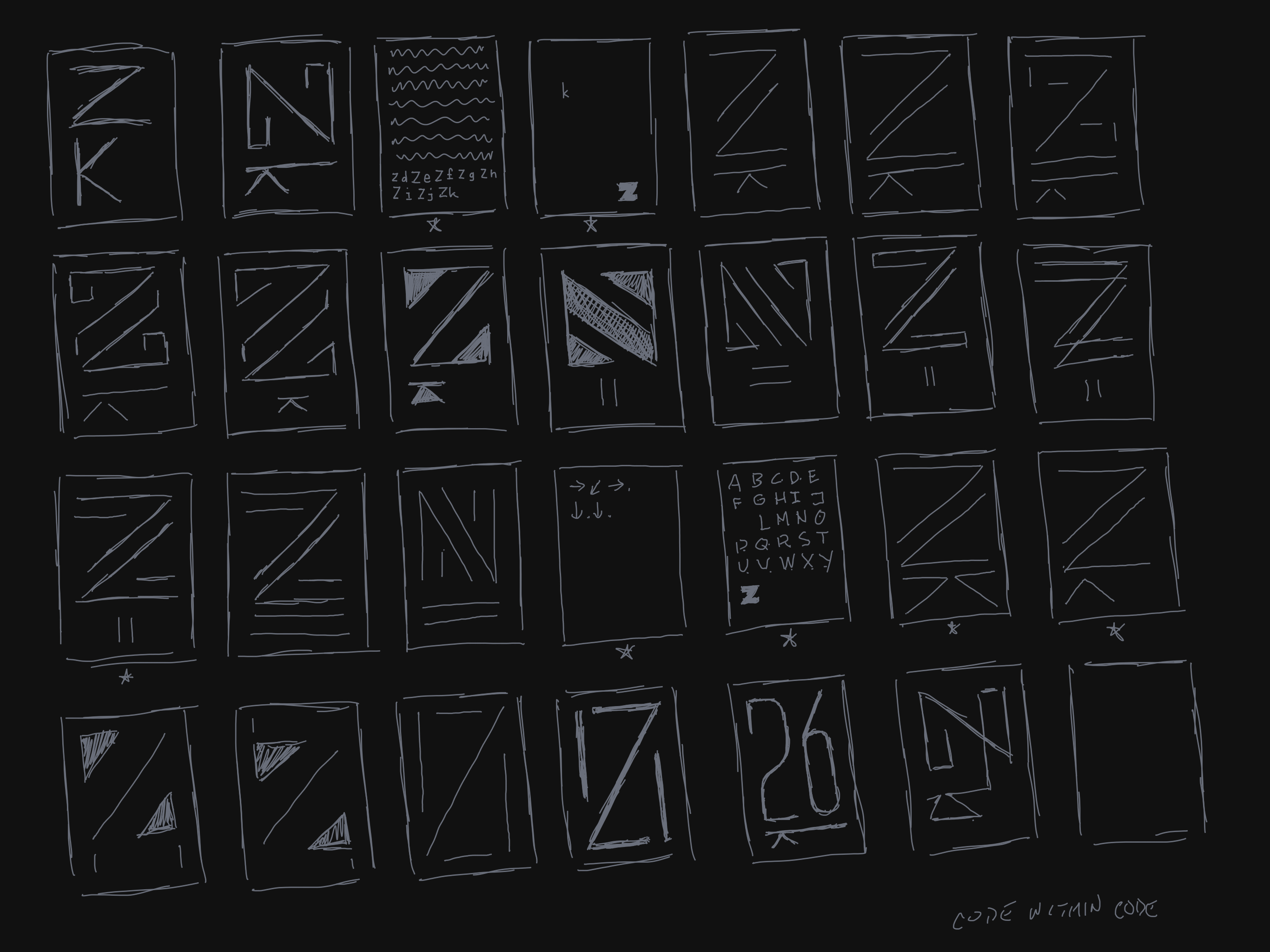
By the time I got back to the office, I had a whole bunch of thumbnails and I quickly roughed out my favorites and some new ideas in Illustrator.

My first deadline was quickly approaching and I didn’t have time to refine all of these, so I narrowed it down even farther, threw some color in and sent them off to Margaret. One of these, my favorite one, was a tiny faux piece of paper containing “→,↙,→.↓.↓.” I explained what it meant to Margaret and said that I liked it but that it was way too super-duper weird so just ignore it.

Margaret presented these to the crew at Wired. She wrote to tell me that they liked two of my ideas. The most popular one was the magenta/yellow composition, but they wanted the K to be more prominent. (They were correct. I had used an abstracted 11 instead of K and it was too hard to see.) They also liked “→,↙,→.↓.↓.” but thought that it was too subtle. Margaret encouraged me to explore other ways to make “→,↙,→.↓.↓.” work. So, I made adjustments to the magenta/yellow and was pretty sure that this would be the winner. I figured that “→,↙,→.↓.↓.” was a goner, so I made more ludicrous interpretations of the idea: a faux Post-It, huge but nearly invisible arrows and tiny on the back of a page of text. I sent this off and started prepping the magenta/yellow art for production.

Margaret wrote back and said that they really liked the “→,↙,→.↓.↓.” on the back of the page of text. The only thing that they were wondering was if I could find a way to get some hints about how to translate “→,↙,→.↓.↓.” somewhere in the backwards text. That put an interesting spin on the whole thing and I thought that it would be pretty funny to explain exactly where the idea for “→,↙,→.↓.↓.” came from. This explanation itself would be the clue. I wrote, diagrammed and designed it to look like a white paper, sent it off to be reviewed for grammar, spelling, etc. by the editors, made text changes, sent the file off and here we are.

So, what does “→,↙,→.↓.↓.” mean? Okay, so, here we go: As part of my job as a typeface designer, I write a lot of code. One problem that I ran into years ago was that I needed to be able to correlate shapes across > 1 fonts so that I could perform math operations on them. Humans are very good at performing operations like, “this part of the a in the light weight is the same thing as this part of the a in the heavy weight.” Doing the same thing with code is hard because these shapes are represented by very precise numbers. An algorithmic attempt at correlating these number arrays is going to stall on minute differences that our eyes know are irrelevant. I was pondering this many years ago and realized that I could convert the number arrays into a sequence of movement descriptions—up, down, left, right—and these movements would be significantly easier to correlate because they are less precise without losing the general meaning. For example, using a number array, a square looks like this: [(10, 10), (10, 20), (20, 20), (20, 10), (10, 10)]. The same square in a different font will probably have different numbers: [(50, 50), (50, 70), (70, 70), (70, 50), (50, 50)]. A movement description for both both of these squares is [↑, →, ↓, ←]. This solved my correlation problem, and some other problems, and has been a “trade secret” up until the idea was published in Wired.
I was reminded of this abstraction as I was looking at my angular Z and K sketches. That’s where “→,↙,→.↓.↓.” came from. If you interpret the comma as “a direction change in continuous movement sequence” and the period as “the end of a movement sequence” you end up with Z | |. Issue Z is a letter substitution for 26. || looks like 11. Put them together and you get 26.11.
Huge, huge, huge thanks to Margaret and everyone at Wired for letting me get away with this.
Commissioned Work


