
CNT Series
For the last couple of years, I’ve been collaborating with Caleb Bennett on some unusual typefaces for Condé Nast Traveler. The collaboration itself has been a bit unusual as well. Most of the time my clients approach me to make “something” for them without having a clear visual starting point in mind. We talk a lot about what the typeface needs to do, I draw some sketches, we talk about them and we proceed almost linearly from there. These projects for Caleb are not like that at all.
First off, Caleb is an amazing designer with a very distinct, personal sense of pacing, contrast, space, proportion and all the things that go into graphic design. He always has an idea that sets the general path for the project. This can be a photo of a sign that he likes the composition of, an idea about how to abuse a classic typeface or any other thing that could be floating in his head. I think about it and quickly visualize it. We talk about the result, then I make changes and we repeat until the last minute before the issue goes to press. Sometimes we’ll completely start over, sometimes we’ll jump back a few steps and so on. It’s very non-linear. The final results are unexpected and the collaboration really challenges my own instincts and tendancies.
The typefaces themselves are unusual in that they aren’t really typefaces. Well, technically they are but that’s just the delivery method. Really, they are just containers of stuff that Caleb can play with. I usually draw him a set of different weights, widths and a slew of alternate shapes. Sometimes the typefaces are used in a straightforward way and sometimes the individual shapes get mixed and matched into complex compositions. I never know what he is going to do.
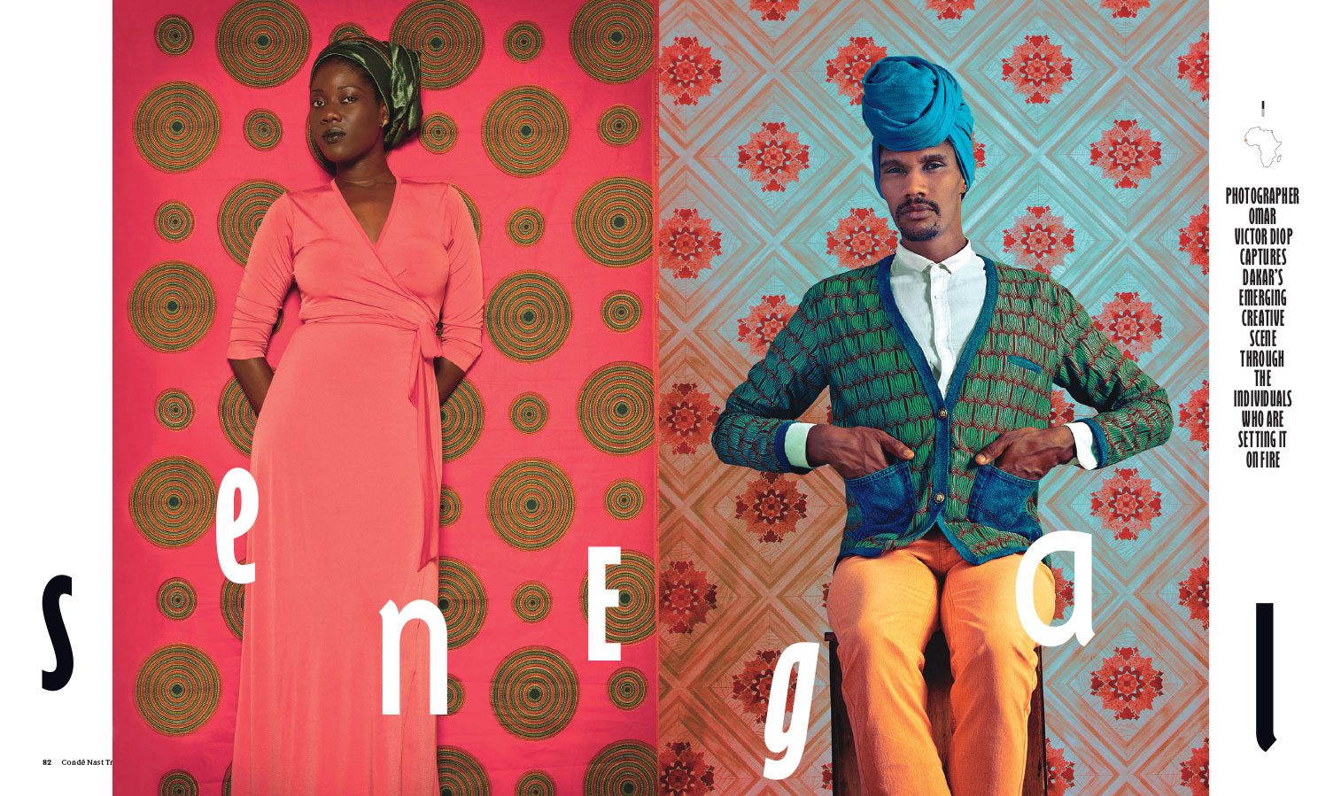
I’m a nerd about the process of making things. I remember reading a story about how master painters had trusted paint makers that they would collaborate with to produce their raw materials. The paints would be made to the painter’s specific needs and preferences. That’s really cool and it’s how I feel about making these things for Caleb. Most of the time, my typefaces are little machines that go and do their job without getting in the way. These typefaces for Caleb aren’t like that at all. They are raw materials that are specifically made for him. Showing the typefaces here, out of context wouldn’t really be terribly interesting or reflective of them. Instead here are some of the spreads and details that have used the typefaces that I’ve made.
CNT DF
This one is loosely based on a sign Caleb saw in Mexico City. We made it much, much stranger than the original lettering.


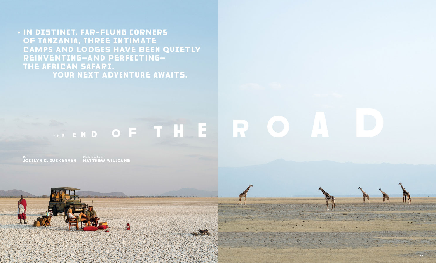
CNT Chill Gill
When Caleb and his team redesigned the magazine, they brought in some great typefaces from Commercial Type to do most of the typographic work. They also started using Gill Sans Bold Extra Condensed, which is, ahem, an interesting choice. That typeface is, ahem, a bit nuts but Caleb wanted it to be even nuttier. I drew a new typeface loosely inspired by the original metal version of Gill Sans, but with amplified drawing oddities, redundant inconsistencies, a huge range of alternates and a lot of flat out bizarre details.


CNT Elegante
This one started off with another photo of a sign in Mexico. It went…pretty far away from that into something with really delicate hairlines.


These typefaces are licensed exclusively to Condé Nast Traveler. Besides, they probably won’t work for anyone other than Caleb.
Commissioned Work


